Brand Guidelines · Abdul Studio · 2026
Every pixel.
Intentional.
This document defines the visual and verbal identity of Abdul Studio — the design practice of Abdulrahman Alaa, Art Director and Creative Designer based in Giza, Egypt. These guidelines ensure consistency, professionalism, and brand integrity across all touchpoints, tools, and client work.
00 — Foundation
Design DNA
The non-negotiables that define Abdul Studio's aesthetic. Every tool, document, and deliverable must embody these principles without exception.
Aesthetic
Dark & Deliberate
Dark backgrounds (#0e0e0e → #2e2e2e) are mandatory for all UI and tools. White is reserved exclusively for exported client documents — proposals, quotations, agreements.
Dominant Accent
#29aee6 — Sky Blue
One accent color, used everywhere interactive and branded. Never compete with it. Never introduce a second accent without a documented reason.
Typography
Syne leads, DM Sans supports
Syne owns all headings, labels, buttons, and UI text. DM Sans handles body copy. JetBrains Mono is strictly for code and data.
Layout
Sidebar + Main
All tools follow the same 54px topbar + sidebar + scrollable main grid. Predictable structure builds trust and reduces cognitive load.
Shape Language
Pill buttons. Rounded cards.
Buttons always 99px radius (pill). Cards 10–14px. Inputs 10px. Documents 20px. Never hard corners on UI elements.
Motion
Subtle & purposeful
0.2s ease transitions. 1–2px hover lifts. Fade-ups on scroll. Ambient animations for brand moments only. Every motion earns its place.
01 — Identity
Logo System
Abdul Studio uses four logo variants — all built around the same illustrated mascot character. Each variant serves a specific context. Use the correct one — never mix-and-match contexts.
Wordmark Variants — "Abdul."
Mascot Variants — "The Curious Man Bun"
Variant Guide — When to Use What
01 · Wordmark
On Dark / On Light
The everyday wordmark. Use on dark UI backgrounds, export headers, and email signatures. Flip to the on-light version for printed collateral and white-background documents.
02 · Glass
Dark Surfaces
Elevated variant for premium hero sections, presentation covers, and dark UI contexts requiring maximum brand presence. The glass effect adds depth and craft.
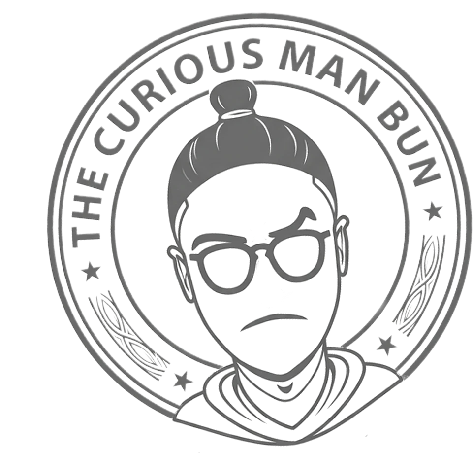
03 · Stamp
Documents & Approval
The circular approval badge. Placed on proposals, quotations, and signed agreements as an authority mark. Always monochrome — never colored.
04 · Typographic
Minimal Contexts
Pure type mark for footer credits, watermarks, and social media captions. No embellishment. Maximum legibility at small sizes.
01 · Primary
Flat Vector — Sky Blue
The everyday mascot logo. Works universally on dark backgrounds. Nav bars, portfolio, social media profiles, dashboards. The blue circle creates instant recognizability at any size.
02 · Premium
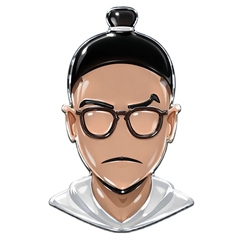
Glass / 3D Chrome
The elevated mascot. Chrome and glass rendering adds depth and prestige. Sidebar headers, email signatures, business cards, and client presentation covers on light or white backgrounds.
03 · Dark Mode
Dark Background
The seamless app icon variant. Flat character with no circle crop — pure black surround blends into dark contexts. Loading screens, desktop wallpapers, dark splash states.
04 · Authority
Stamp / Badge
The circular approval mark. Placed on proposals, quotations, and agreements. Always monochrome grey — never colored. Communicates craft, authenticity, and a human touch.
Clearspace Rule
minimum clearspace = logo height × 0.25 on all sides

Maintain minimum clearspace equal to 25% of the logo's height on all four sides — for all four variants. No text, icon, edge, or border may intrude into this zone.
Wordmark Don'ts
The "Abdul." wordmark must always appear in its exact, unmodified form. These are the six most common misuses to avoid:
✕
Don't desaturate or use grey
✕
Don't recolor with off-brand colors
✕
Don't alter letter-spacing
✕
Don't use wrong typeface
✕
Don't add glow or text effects
Mascot Logo Don'ts
The illustrated character — "The Curious Man Bun" — is original artwork and must be treated with the same integrity as the wordmark. These misuses are strictly prohibited:
✕
Don't desaturate, grey-out, or reduce opacity below 80%
✕
Don't flip, mirror, or rotate
✕
Don't recolor, apply hue shifts, or filter adjustments
✕
Don't stretch, squish, or break the 1:1 ratio
✕
Don't add colored drop shadows or external effects
✕
Don't place two logo variants side-by-side or stack without approval
Seasonal Logo Adaptations
The mascot character is seasonally customized for special occasions, holidays, and campaigns. Currently 10 approved seasonal variants exist (2.1 – 2.10). Each variant is a limited-use adaptation of the primary logo — the core character design and proportions are never altered, only dressed or accessorized for the season.
Movie Premire Variant
Deadpool and Wolvarine Movie
New Season Premire Variant
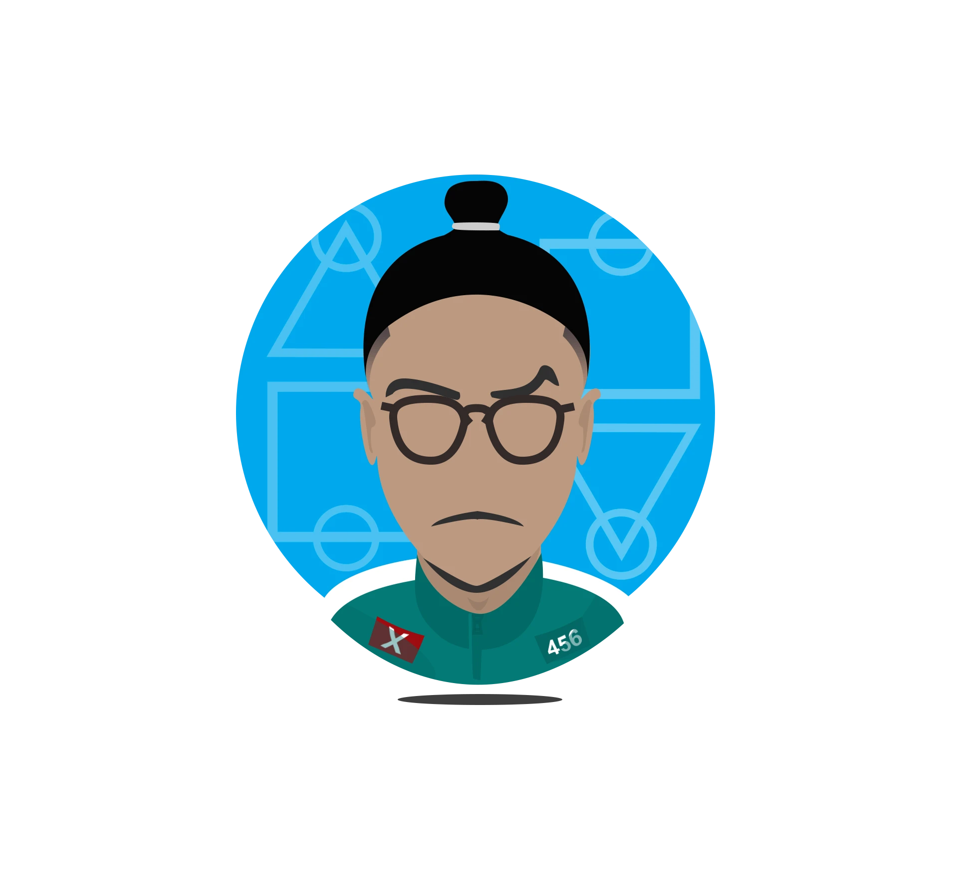
Squid Game III
Movie Admiration Variant
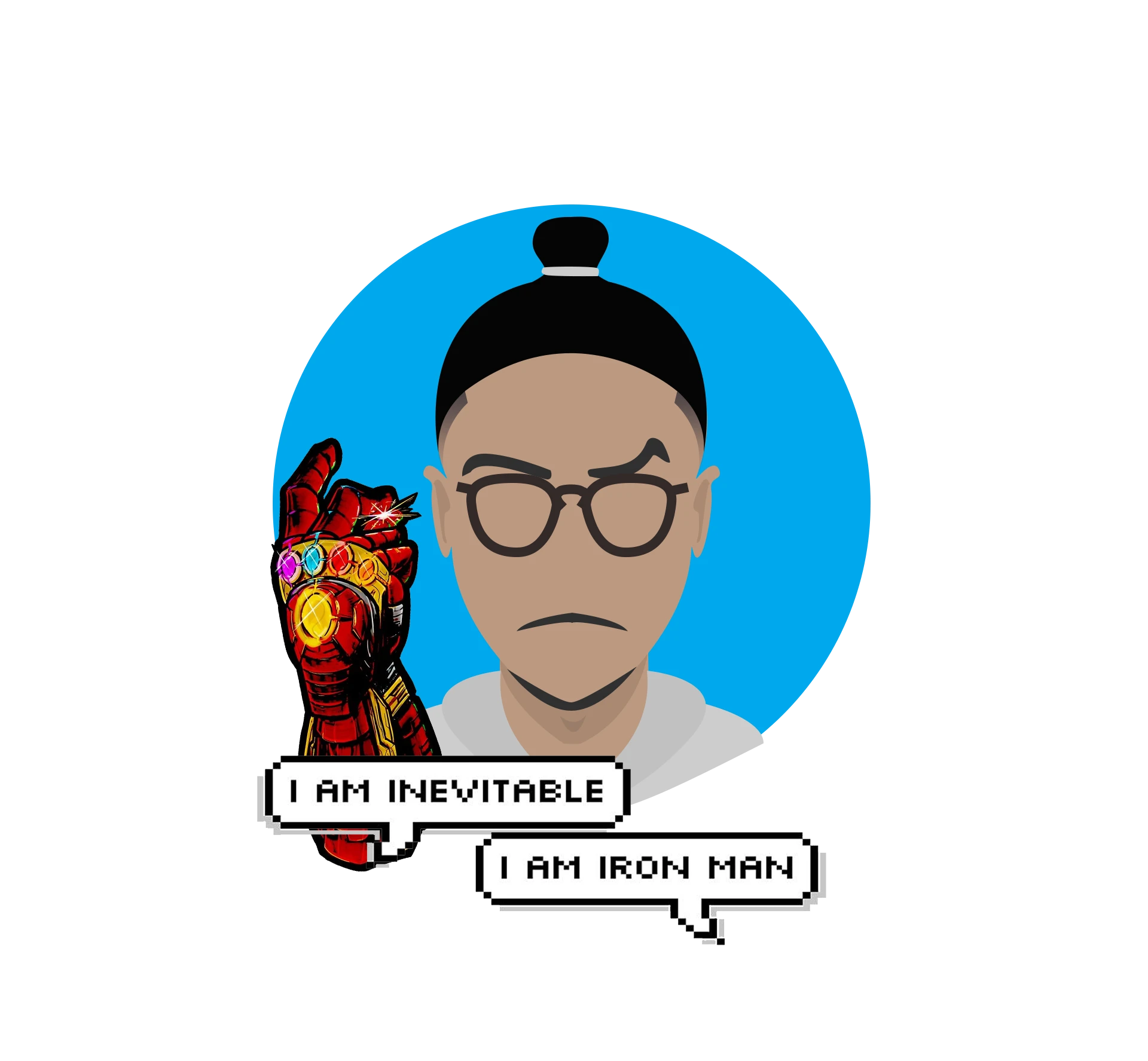
MCU Fandom
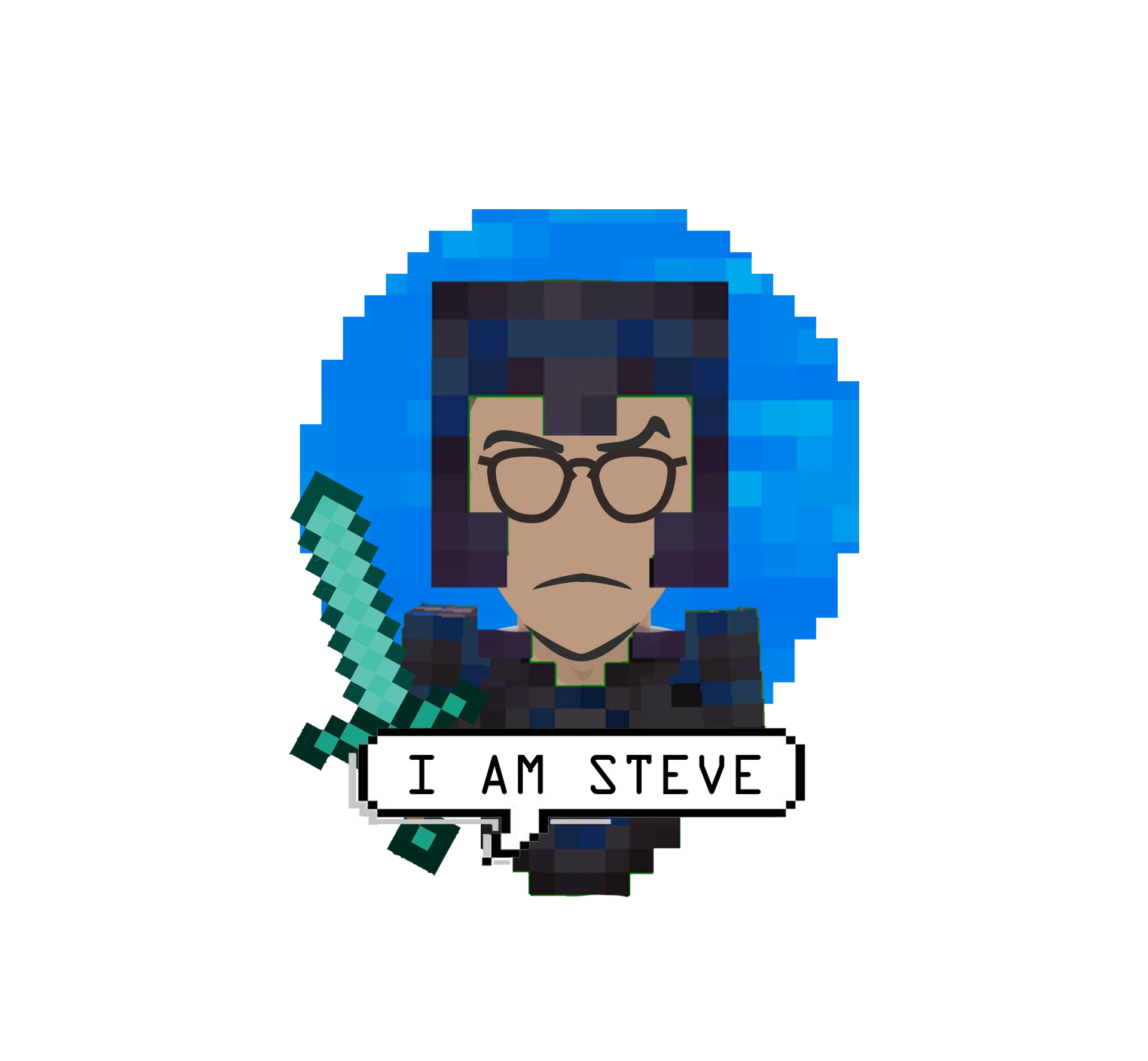
Movie Premire Variant
Minecraft Movie
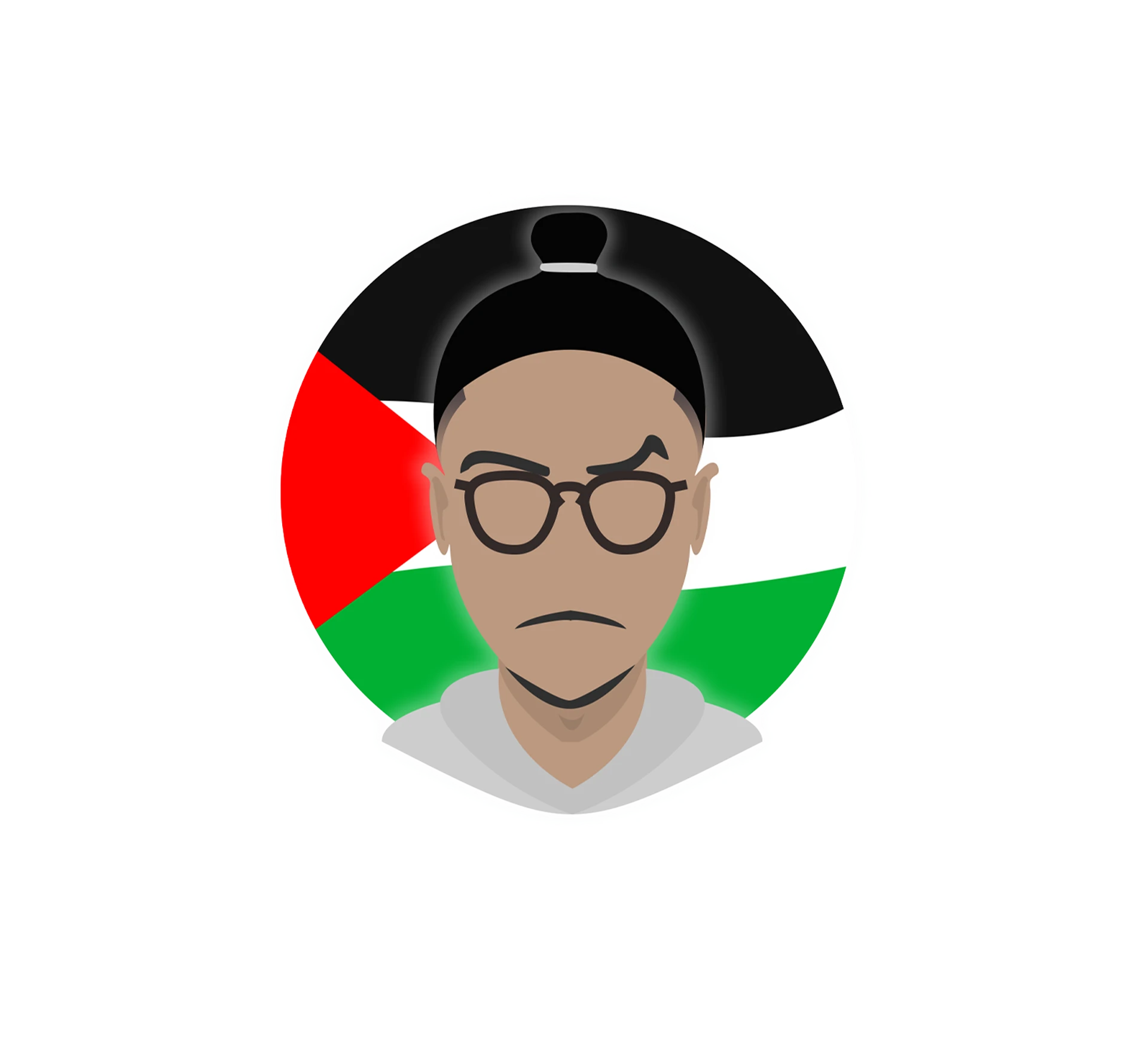
Palestine solidarity Variant
Free Palestine 🍉
Seasonal Variant
BSc Graduation
Seasonal Variant
Eid Adaha/Feter
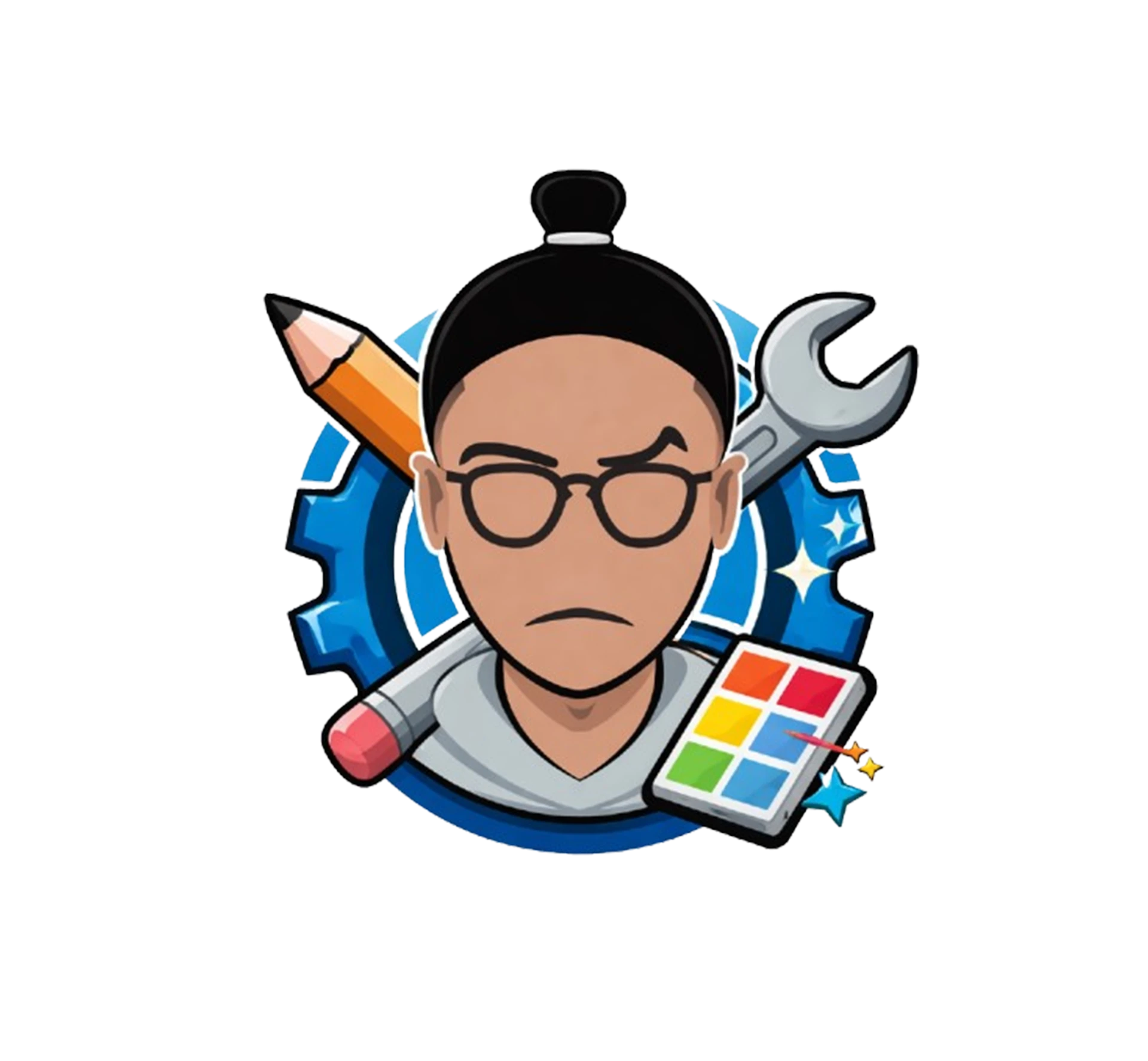
Functional Variant
Craftsman Representaion
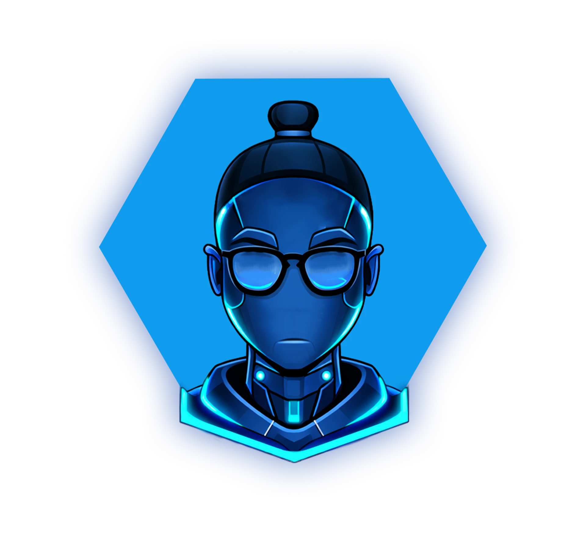
Functional Variant
AI Agent Robotic Me
✓
Core character is always preserved
The man bun silhouette, glasses, expression, skin tones, and body proportions remain identical across all seasonal variants. Only accessories, clothing, or overlaid elements change.
✓
1:1 square ratio is mandatory
All seasonal variants maintain a 1:1 aspect ratio. They are always cropped to square — never portrait or landscape — to ensure consistency across all platforms.
✓
Limited-duration usage only
Each seasonal variant is active only during its designated period (e.g., Ramadan, Eid, national holidays). After the period ends, revert to the primary logo variant immediately.
✓
Profile picture use only
Seasonal variants are intended for profile pictures, social media posts, and digital-first contexts. They are never used in formal client documents, printed materials, or contracts.
✕
Never use in client deliverables
Seasonal variants must never appear on proposals, quotations, agreements, or any formal document delivered to a client. Always use the primary or stamp variant for professional documents.
✕
No unofficial seasonal designs
Only the 10 approved variants (2.1–2.10) are authorized for use. Do not create new seasonal adaptations without going through the same design process and adding them to this document.
02 — Color
Color System
The palette is intentionally tight — one dominant accent, a deep neutral scale, and three semantic status colors. Do not introduce new hues without a strong documented reason.
Sky
#29aee6 · --sky
Primary Accent · Interactive · Brand · Click to copy
Studio Black
#0e0e0e
Page Background
Off White
#f0f0f0 · --white
Primary Text · Docs bg
Brand Accent Scale
Sky
#29aee6
--sky · Primary
Sky Hover
#1a8fc4
--sky2 · Hover state
Sky Deep
#0e5a6e
--sky3 · Gradients
Sky Dim
rgba(41,174,230,.12)
--sky-dim · Active bg
Background Scale
BG2
#212121
--bg2 · Sidebar
Status Colors
Success Green
#2ecc71
Deploy success, live status
Error Red
#e74c3c
Errors, destructive actions
Warning Amber
#f39c12
Processing, caution
Text Color Hierarchy
Level
Sample
Token / Value
Alpha
Primary
Headings & key UI
--white · #f0f0f0
100%
Secondary
Body copy, descriptions
--muted · rgba(240,240,240,.42)
42%
Tertiary
Nav labels, hints
--muted2 · rgba(240,240,240,.18)
18%
Accent
Interactive / Brand
--sky · #29aee6
100%
03 — Typography
Type System
Three typefaces. Three distinct roles. Never substitute without brand approval. All are available free via Google Fonts and defined as CSS custom properties.
Syne
--fh · Headings, Labels, Buttons, all UI text
Syne:wght@400;600;700;800
800
Brand Identity · Art Direction
700
Project Questionnaire — Client Brief
700
Build Proposal · Send Quotation · Section Titles
400
SECTION LABEL · BADGE TEXT · EYEBROW COPY
DM Sans
--fb · Body text, inputs, descriptions, all prose
DM+Sans:wght@300;400;500;600
300
I'm a multi-disciplinary creative with 4+ years of experience turning complex ideas into bold visual systems. From brand identity and UI/UX to web development and art direction — I bridge the gap between strategy and aesthetics, always putting impact first.
400
Standard body text at regular weight. Used for descriptions, metadata, and general UI copy across all tools.
500
Form labels · Field descriptions · UI metadata · Subtle emphasis
JetBrains Mono
--fm · Code, hex values, references, tokens, timestamps
JetBrains+Mono:wght@400;500;600
400
#29aee6 · QT-2026-001 · AG-2026-042 · v1.0.0
400
font-family: 'Syne', sans-serif; · --sky: #29aee6; · border-radius: 99px;
500
[14:23:07] Deploy successful · data.js is now live
UI Type Scale Reference
clamp(3.5rem, 5.5vw, 7rem)
Syne 800 · lh .88
Hero Title
2rem – 2.4rem
Syne 800 · ls -.05em
Page Title
1.2rem – 1.6rem
Syne 800 · ls -.03em
Section Title
0.9rem – 1rem
Syne 700
Card Title
0.76rem – 0.84rem
Syne 700 · ls .03em
Button / Nav
0.88rem – 0.95rem
DM Sans 300 · lh 1.85
Body long-form
0.78rem – 0.84rem
DM Sans 400
Body standard
0.52rem – 0.68rem
Syne 700 · Uppercase · ls .18em
LABEL / BADGE
04 — Visual
Gradients
Six approved gradient recipes used across all Abdul Studio tools and documents. Copy exact values — do not improvise or add new color stops.
Document Header
linear-gradient(135deg, #111 0%, #1e2a32 55%, #0e3a4a 100%)
All exported docs — proposals, quotations, agreements, briefs
Hero Background Glow
radial-gradient(ellipse at 70% 0%, rgba(41,174,230,.28) 0%, transparent 65%)
Hero sections · Cover pages · Section backgrounds
Spinning Ring / Card Shine
conic-gradient(from 180deg, #29aee6, #0e5a6e, #29aee6)
Avatar ring · Certification card borders · Animated card edges
Progress / Sky Bar
linear-gradient(90deg, #29aee6, #1a8fc4)
Progress bars · Loading fills · Questionnaire indicator
Content Fade
linear-gradient(to bottom, transparent 0%, var(--bg) 80%)
Project grid "show more" overlay · Certificate section fade
Accent Bar
linear-gradient(90deg, #29aee6, #0e5a6e)
Agreement footer accent strip · Section divider highlights
05 — Communication
Voice & Tone
Abdul Studio communicates with confidence, clarity, and craft. The brand voice is direct — not corporate, not casual. It respects the client's intelligence while making the creative process feel effortless.
Brand Personality Pillars
🎯
Precise
Every word and pixel serves a purpose. No filler, no hedging.
💡
Confident
We make recommendations, not suggestions. We own our craft.
🤝
Human
Warm and accessible. No jargon. The client is a partner.
⚡
Forward
Always oriented toward the outcome. Progress and results.
Do This. Not That.
✓ Do this
🎯 Build Your Proposal · 📤 Publish Updates
Action verbs with intention and ownership. Emojis used sparingly as visual anchors in UI only — never in printed client documents where they feel out of place.
✕ Not this
Click here to submit your information
Passive. Generic. Zero energy. Does not reflect a confident, craft-forward creative practice.
✓ Do this
"This proposal is not about changing the brand — it's about evolving it."
Confident framing. Addresses client anxiety directly. Positions the work as collaborative growth, not disruption.
✕ Not this
"We would like to suggest some possible changes you might want to consider."
Hedging language kills credibility. The client hired you for your expertise — use it without apology.
✓ Do this
"Turning ideas into bold experiences."
Short. Declarative. Visual. The reader immediately pictures the outcome. Strong verb, strong noun.
✕ Not this
"We provide comprehensive creative design solutions for businesses of all sizes across the region."
Sounds like every agency. No personality, no specificity. Could be anyone, anywhere.
06 — Legal
Usage Rights
These guidelines govern how the Abdul Studio brand, logos, and visual assets may and may not be used by clients, collaborators, and third parties.
Permitted
✓
Client Portfolio Attribution
Clients may credit "Design by Abdul Studio" or "by Abdulrahman Alaa" in their materials when referencing work created by the studio. The wordmark may be displayed unaltered for this purpose only.
✓
Press & Editorial Mentions
Journalists and publications may use the studio name and primary logo in editorial contexts with accurate attribution, provided the mark is not altered and not used commercially.
✓
Internal Sharing — Approved Clients
This document and brand assets within may be shared internally within approved client organizations for maintaining consistency on shared deliverables only.
Not Permitted
✕
No Unauthorized Reproduction
The Abdul Studio logo, wordmark, stamp, mascot illustration, and any other brand marks may not be reproduced, copied, or displayed without prior written permission from Abdulrahman Alaa.
✕
No Modifications
Brand marks may not be altered, recolored, distorted, combined with other logos, animated without permission, or used in any way that misrepresents or dilutes the studio's identity.
✕
No Third-Party Commercial Use
No third party may use the Abdul Studio brand to promote their own products or services, or imply partnership or endorsement without a signed formal agreement.
Use With Caution
⚠
Social Media Tagging
Clients sharing work on social platforms are encouraged to tag the studio, but must not imply that the studio endorses positions, products, or messages unrelated to the design work delivered.
⚠
AI-Generated Content Using Brand Assets
Feeding Abdul Studio logos or the mascot illustration into AI image generators for remixing, training, or derivative creation is not permitted without explicit written approval.
07 — Copyright
Copyright & Ownership
© 2020 – 2026 Abdulrahman Alaa
All Rights Reserved · Abdul Studio
All brand assets, design systems, visual guidelines, mascot illustrations, and creative work produced by Abdul Studio are the intellectual property of Abdulrahman Alaa unless explicitly transferred in writing via a signed services agreement.
Ownership of final deliverables transfers to the client only after full payment has been received, as stated in the relevant services agreement. Source files, working files, and design systems remain the property of the studio unless otherwise negotiated and documented in writing.
The studio retains the perpetual right to showcase all completed work in its portfolio and marketing materials, unless the client requests confidentiality in writing before project commencement.
Tools & Coded Work
All coded tools developed as part of Abdul Studio works — including this document — are proprietary and may not be distributed, cloned, or used as a template without permission.
Mascot Illustration
The "Curious Man Bun" character — in all four variants and all seasonal adaptations — is original artwork owned exclusively by Abdulrahman Alaa. It may not be reproduced, remixed, or submitted to AI training datasets without written consent.
Client Deliverables
Logos, brand identities, UI designs, and other client-specific deliverables become the property of the client upon full payment receipt. The studio retains portfolio rights unless a written NDA covers the specific deliverables.
Third-Party Assets
Google Fonts (Syne, DM Sans, JetBrains Mono) are used under their respective open-source licenses. Any stock imagery or third-party resources used in client deliverables are subject to their own licensing terms and documented in the project handoff notes.